Input
Schema
{
  "$schema": "https://json-schema.org/draft/2019-09/schema",
  "title": "Input control",
  "description": "A single line text field",
  "type": "object",
  "required": [
    "option"
  ],
  "properties": {
    "control": {
      "const": "input"
    },
    "label": {
      "title": "Label",
      "description": "Input label",
      "type": "string"
    },
    "placeholder": {
      "title": "Placeholder",
      "description": "Input placeholder text",
      "type": "string"
    },
    "prefix": {
      "type": "object",
      "description": "A string or icon to prepend to the input. Provides input context to the user.",
      "oneOf": [
        {
          "$ref": "#/definitions/iconAffix"
        },
        {
          "$ref": "#/definitions/textAffix"
        }
      ]
    },
    "suffix": {
      "type": "object",
      "description": "A string or icon to append to the input. Provides input context to the user.",
      "oneOf": [
        {
          "$ref": "#/definitions/iconAffix"
        },
        {
          "$ref": "#/definitions/textAffix"
        }
      ]
    },
    "definitions": {
      "iconAffix": {
        "title": "Icon Affix",
        "description": "The icon to prefix or append to an input",
        "type": "object",
        "required": [
            "type",
            "name"
        ],
        "additionalProperties": false,
        "properties": {
          "type": {
            "type": "string",
            "description": "The affix type to be used.",
            "enum": ["icon"]
          },
          "name": {
            "type": "string",
            "description": "The name of the icon that will be prended or appended to the input."
          }
        }
      },
      "textAffix": {
        "title": "Text Affix",
        "description": "The text to prefix or append to an input",
        "type": "object",
        "required": [
            "type",
            "content"
        ],
        "additionalProperties": false,
        "properties": {
          "type": {
            "type": "string",
            "description": "The affix type to be used.",
            "enum": ["text"]
          },
          "content": {
            "type": "string",
            "description": "The text to append or prepend to the input."
          }
        }
      }
    }
    "value": {
      "title": "Value",
      "description": "Input value",
      "type": "string"
    }
  }
}
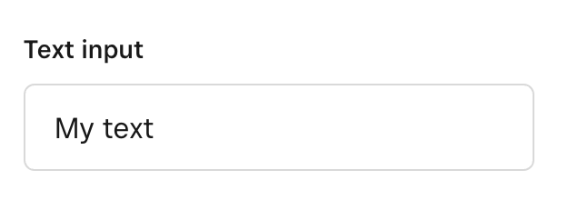
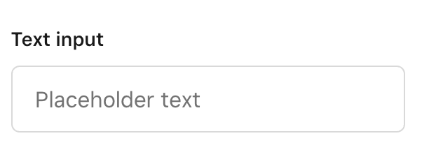
Example
{
  "control": "input",
  "label": "Text input",
  "value": "My initial text",
  "placeholder": "Placeholder text"
}
Example with an icon prefix
{
  "control": "input",
  "label": "Text input",
  "value": "My initial text",
  "prefix": {
    "type": "icon",
    "name": "pencil-in-box"
  }
  "placeholder": "Placeholder text"
}
Example with a text suffix
{
  "control": "input",
  "label": "Number input",
  "value": "10",
  "prefix": {
    "type": "text",
    "content": "px"
  }
  "placeholder": "Placeholder text"
}