Button Group
Use button group as an alternative to radio buttons when you want the user to choose a single option from a set.
Schema
{
  "$schema": "https://json-schema.org/draft/2019-09/schema",
  "title": "Button Group Control",
  "description": "A set of buttons that display conjoined in a row.",
  "type": "object",
  "required": [
    "option",
    "buttons"
  ],
  "properties": {
    "control": {
      "const": "button-group"
    },
    "label": {
      "title": "Label",
      "description": "Button group label",
      "type": "string"
    },
    "icon": {
      "title": "Icon",
      "description": "Icon to display in button",
      "type": "string"
    },
    "value": {
      "title": "Value",
      "description": "Button group value",
      "type": "string"
    },
    "buttons": {
      "title": "Buttons",
      "description": "List of buttons",
      "type": "array",
      "items": {
        "type": "object",
        "additionalProperties": false,
        "required": [
            "label",
            "value"
        ],
        "properties": {
            "label": {
                "title": "Label",
                "description": "Button label",
                "type": "string"
            },
            "value": {
                "title": "Value",
                "description": "Button value",
                "type": "string"
            }
        }
      }
    }
  }
}
Example
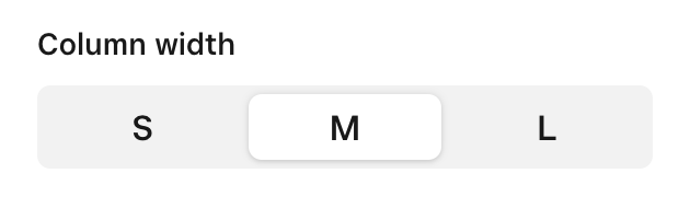
Example using text
{
    "control": "button-group",
    "label": "Column width",
    "value": "medium",
    "buttons": [
        {
            "label": "S",
            "value": "small"
        },
        {
            "label": "M",
            "value": "medium"
        },
        {
            "label": "L",
            "value": "large"
        }
    ]
}
Example using icons
{
    "control": "button-group",
    "label": "Alignment",
    "value": "left",
    "buttons": [
        {
            "icon": "chevron-left",
            "value": "left"
        },
        {
            "icon": "chevron-right",
            "value": "right"
        },
        {
            "icon": "chevron-up",
            "value": "top"
        },
        {
            "icon": "chevron-down",
            "value": "bottom"
        }
    ]
}
Available icons
Available icons can be found at Editor Controls