Group Toggle
Group controls together to create a section of related controls. The group-toggle control is a variation of the group control that includes a toggle switch. A group-toggle can also be rendred within a group control.
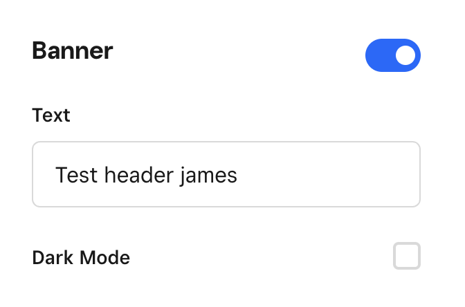
Toggled off state

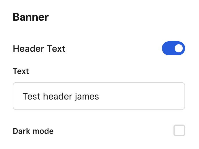
Nested within group control
Schema
{
  "$schema": "https://json-schema.org/draft/2019-09/schema",
  "title": "Group Toggle Control",
  "description": "Renders related controls together in a toggleable group.",
  "type": "object",
  "required": [
    "label",
    "children",
    "value"
  ],
  "properties": {
    "control": {
      "const": "group-toggle"
    },
    "label": {
      "title": "Label",
      "description": "Group label",
      "type": "string"
    },
    "value": {
      "title": "Value",
      "description": "Toggle value",
      "type": "boolean"
    },
    "children": {
      "description": "List of contained controls",
      "type": "array",
      "items": {
        "type": "object"
      }
    }
  }
}
Example
{
    "control": "group-toggle",
    "label": "Header",
    "value": {
        "$ref": "#/schema/headerEnabled"
    },
    "children": [
        {
            "control": "input",
            "label": "Text",
            "value": {
                "$ref": "#/schema/header"
            }
        },
        {
            "control": "checkbox",
            "label": "Dark mode",
            "value": {
                "$ref": "#/schema/darkMode"
            }
        }
    ]
}