How to: Use Editor Controls
The Editor Controls allows theme developers to create user-friendly interfaces for the sellers to edit their site without requiring them to manually manipulate JSON files. This is an optional but additive feature that will allow less technical sellers edit their site with less risk of breaking the data structures required to render the page.
Controls can be added to page template and section templates and will only be used within the context of the editor. It will have no direct effect on the performance of the published site as it is ignored during render.
Basic example
Controls consist of small primitive building blocks that manipulate data resources defined in the page files. Take for example the following controls that allows the seller to manipulate the title and subtitle of this “Header section”:
page.json
{
  "header": {
    "props": {
      "title": "Title",
      "description": "Subtitle"
    }
  }
}
header.html.twig
<h1>{{ title }}</h1>
<h2>{{ description }}</h2>

{% schema %}
{
  "title": {
      "type": "string"
  },
  "description": {
      "type": "string"
  }
}
{% endschema %}

{% editor %}
{
  "name": "Header section",
  "controls": [
    {
      "control": "input",
      "label": "Title",
      "value": {
        "$ref": "#/schema/title"
      }
    },
    {
      "control": "textarea",
      "label": "Description",
      "value": {
        "$ref": "#/schema/description"
      }
    }
  ]
}
{% endeditor %}
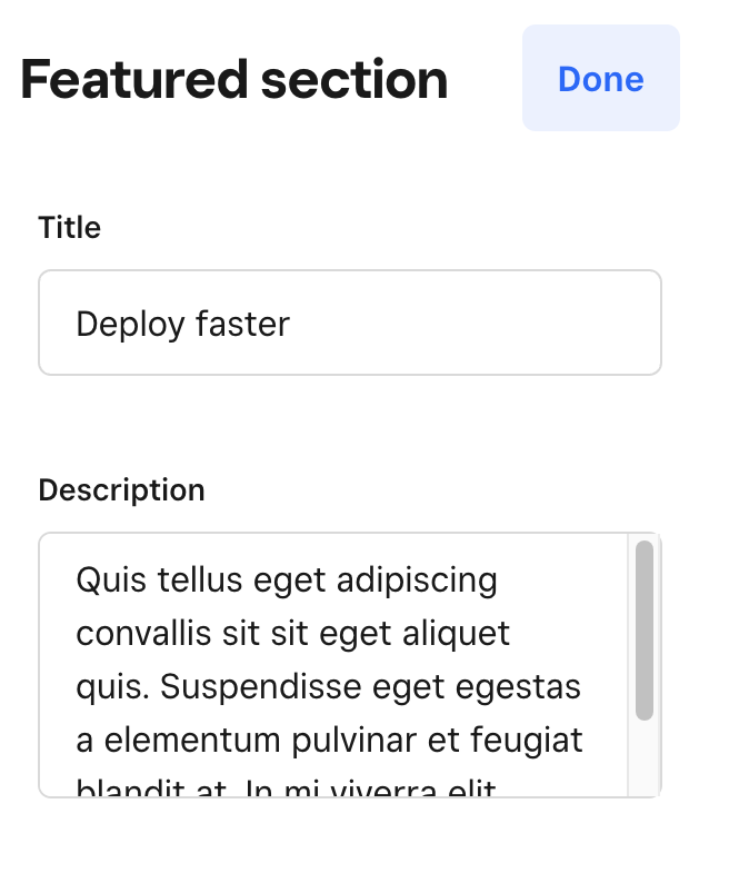
The example above will render two editing controls in the editor. Each control is defined to read and write from two properties via the value tag with a JSON pointer to the respective schema value. When the seller makes any changes to these controls it is automatically saved to the page and the changes are reflected in the editor preview.
Value references
Many of the controls accept a value reference, in most cases you’ll want to use a JSON pointer to reference a value in the schema tag. This enables the editor to dynamically read and write to the correct property in the page file:
{% schema %}
{
  "title": {
      "type": "string"
  }
}
{% endschema %}
{% editor %}
{
  "name": "Header section",
  "controls": [
    {
      "control": "input",
      "label": "Title",
      "value": {
        "$ref": "#/schema/title"
      }
    }
  ]
}
{% endeditor %}
You can also hardcode a value to the control as long as it matches the expected data format but it isn’t particularly useful as it will not save the data when changes are made:
{% editor %}
{
  "name": "Header section",
  "controls": [
    {
      "control": "input",
      "label": "Title",
      "value": "My title"
    }
  ]
}
{% endeditor %}
The above will render an input control with the value “My title”, but if a seller changes this value it will not be saved to the page file since we never instructed the editor where to save the data.
Resource controls
Complex controls are also available to allow the sellers manipulate more configuration heavy resource types like the Image, CategoryList, and ItemList.
page.json
{
  "itemSection": {
    "props": {
      "items": {
        "filters": {
          "ids": [
            "14",
            "13",
            "12",
            "10"
          ],
          "square_online_id": true
        }
      }
    }
  }
}
item.html.twig
<b>Items</b>
<ul>
{% for item in items %}
  <li>
    <h3>{{ item.name }}</h3>
    <img src="{{ item.images[0] }}" />
  </li>
{% endfor %}
</ul>

{% schema %}
{
    "items": {
        "type": "item-list"
    }
}
{% endschema %}

{% editor %}
{
    "name": "Items section",
    "controls": [
        {
            "control": "item-list-chooser",
            "label": "Item chooser",
            "value": {
                "$ref": "#/schema/items"
            }
        }
    ]
}
{% endeditor %}
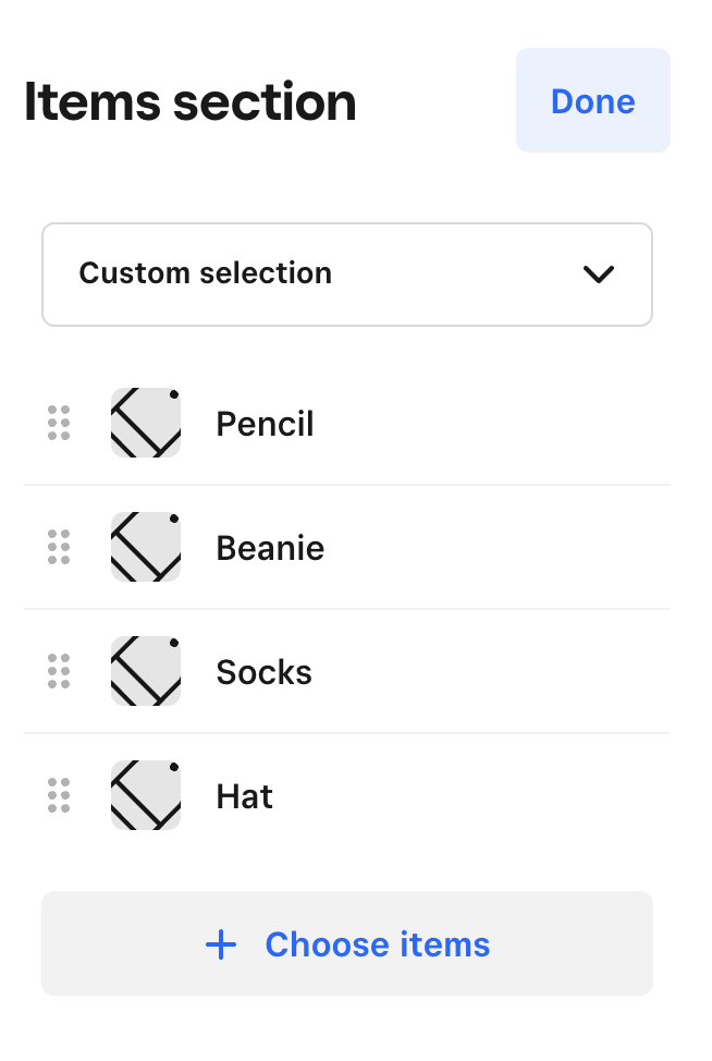
Organizing controls
It is good practice to give the sellers a great editing experience, organizing and grouping your controls can help create a mental model about around what is related and how some controls will interact with certain components.
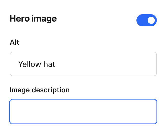
For example, we’ll use the group control to group different primitive controls to create a singular image editing experience:
page.json
{
  "heroSection": {
    "props": {
      "tagline": "Hats",
      "hero": {
        "alt": "Yellow hat",
        "link": {
          "id": "14",
          "type": "product"
        },
        "image": {
          "src": "/yellow_hat.jpg",
          "name": "yellow_hat.jpg",
          "width": 3000,
          "height": 3750,
          "srcset": [],
          "attribution": []
        }
      }
    }
  }
}
hero.html.twig
<div>
  <h1>{{ title }}</h1>
  {% if hero.link is defined and hero.image is defined %}
    <a href="{{ link(hero.link) }}">
      <img alt="{{ hero.alt }}" src="{{ hero.image.src }}" />
    </a>
  {% elseif hero.image is defined %}
    <img alt="{{ hero.alt }}" src="{{ hero.image.src }}" />
  {% endif %}
</div>

{% schema %}
{
  "title": {
    "type": "string"
  },
  "hero": {
    "type": "array"
  }
}
{% endschema %}

{% editor %}
{
  "name": "Hero section",
  "controls": [
    {
      "control": "input",
      "label": "Title",
      "value": {
        "$ref": "#/schema/title"
      }
    },
    {
      "control": "group",
      "label": "Hero image",
      "children": [
        {
          "control": "image",
          "value": {
            "$ref": "#/schema/hero/source"
          }
        },
        {
          "control": "input",
          "label": "Alt",
          "value": {
            "$ref": "#/schema/hero/alt"
          }
        },
        {
          "control": "linker",
          "label": "Link",
          "value": {
            "$ref": "#/schema/hero/link"
          }
        }
      ]
    }
  ]
}
{% endeditor %}
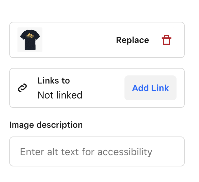
By using the group type we can create a group of controls that help create a mental model for the seller to manipulate the hero image in this section. These include controls that change image source, the image alt tag, and where the image links to.
While these controls can exist individually, combining and grouping primitives together help create a more intuitive experience for sellers.
Group toggle
A variation of the group control is the group-toggle control that creates a group of controls that can be toggled on and off. A common use case would be a group of controls that are tied to an element that is conditionally rendered. For example, the previous example could conditionally render the hero image:
{% editor %}
{
  "name": "Hero section",
  "controls": [
    {
      "control": "input",
      "label": "Title",
      "value": {
	"$ref": "#/schema/title"
      }
    },
    {
      "control": "group-toggle",
      "label": "Hero image",
      "value": {
        "$ref": "#/schema/showHero"
      },
      "children": [
        {
	  "control": "input",
	  "label": "Alt",
	  "value": {
	    "$ref": "#/schema/hero/alt"
	  }
	},
	{
	  "control": "input",
	  "label": "Image description",
	  "value": {
	    "$ref": "#/schema/hero/description"
	  }
	}
      ]
    }
  ]
}
{% endeditor %}
Using twig to generate controls config
Twig is supported within editor tags. You can use it to do all of the usual things you’d do in a template. Some examples described below.
Variable interpolation
Let’s say you have a theme/config/placeholder.json file where you maintain the default placeholders for a bunch of different controls, which looks something like this:
{
  "input": "input placeholder"
}
You can reference that in your editor tag like so:
{% editor %}
{
  "controls": [
    {
       "control": "input",
       "placeholder": "{{ config.placeholders.input }}"
    }
  ]
}
{% endeditor %}
Conditional rendering
Although the group-toggle control exists, it could be re-implemented using twig, here’s an example:
{% editor %}
{
   "controls": [
      {
        "control": "toggle",
        "label": "Font controls",
        "value": { "$ref": "#/schema/showFontControls" }
      },
     {% if showFontControls %}
       {
          "control": "input",
          "label": "Heading font",
          "value": { "$ref": "#/schema/headingFont" }
       },
       {
          "control": "input",
          "label": "Body font",
          "value": { "$ref": "#/schema/bodyFont" }
       }
     {% endif %}
   ]
}
{% endeditor %}
Functions
All twig functions are available, so you could for example use localize if you wanted to localize control labels:
{% editor %}
{
   "controls": [
      {
        "control": "image-chooser",
        "label": "{{ 'controls.image.label' | localize }}",
        "value": { "$ref": "#/schema/image" }
      }
   ]
}
{% endeditor %}