Select/Dropdown
The Select component can render a list of items when clicked. It is primarily composed of a slotted List component. Note that the List component must have the slot="list" attribute set.
See the List Examples for more examples of the types of lists that can be slotted
Component render
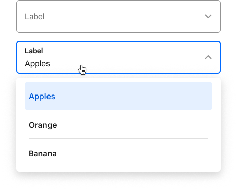
<Select
  onChange={(newValue) => console.log(newValue)}
  placeholder="Label"
>
  <List slot="list">
    <Row value="Apple">
      Apples
    </Row>
    <Row value="Orange">
      Orange
    </Row>
    <Row value="Banana">
      Banana
    </Row>
  </List>
</Select>
Properties
| Property | Type | Description |
|---|---|---|
disabled | boolean | Functionally and visually disables the select. |
invalid | boolean | Whether or not the select is invalid (with the corresponding visual state). |
multiselect | boolean | Whether or not multiselect is enabled. |
name | string | String for the “name” attribute. |
onChange | (e: string) => void | This callback runs whenever the select value changes. |
placeholder | string | A string specifying the placeholder for the select. This is shown when the select is open with no selection. |
popoverStrategy | "absolute" "fixed" | Configuration option for the underlying popover element. By default, the popover will position itself using position: absolute;. If your reference element is within a fixed container, you should use a fixed strategy instead. |
readonly | boolean | Whether or not the select is readonly. |
size | "small" "medium" "large" | String for setting select size. Sizes small and medium visually hide the label, but you should still provide one for accessibility purposes. |
value | string | any [] | A string specifying a value for the select. Must correspond to a value attribute on a slotted Row component. For multiselect, separate values with a comma (e.g. ‘orange,pear’). |
Slots
| Slot | Description |
|---|---|
list | A slotted List component. |
leading-accessory | A slotted Accessory component that can be added as a leading accessory to the select. The common use case is to add an accessorized Icon component. |
trailing-accessory | A slotted Accessory component that can be added as a trailing accessory to the select. The common use case is to add an accessorized Icon component. |