ButtonDropdown
The ButtonDropdown component can render a list of items when clicked, using a Button as the trigger. It is primarily composed of a slotted List component. Note that the List component must have the slot="content" attribute set, and the Button component must have the slot="trigger" attribute set.
See the List Examples for more examples of the types of lists that can be slotted
Component render
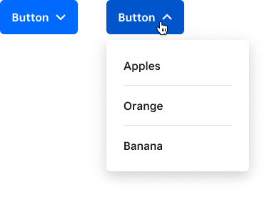
<ButtonDropdown>
  <Button
    slot="trigger"
    title="Show Dropdown"
  >
    Fruit
  </Button>
  <List slot="content">
    <Row value="Apple">
      Apples
    </Row>
    <Row value="Orange">
      Orange
    </Row>
    <Row value="Banana">
      Banana
    </Row>
  </List>
</ButtonDropdown>
Properties
| Property | Type | Description |
|---|---|---|
disabled | boolean | Functionally and visually disables the select. |
interaction | "click" "hover" "persistent" | Defining how the popover should be triggered to open/close. Note that clicks outside the dropdown will always close it. click: popover toggles open/closed on clicks to the trigger or popover. hover: popover opens on trigger mouseover, closes on trigger or popover mouseout. persistent: popover toggles open/closed on clicks to the trigger, popover stays open if users click on it or its content |
noCaret | boolean | Disabling the up/down caret |
popoverPlacement | "auto" "auto-start" "auto-end" "top" "bottom" "right" "left" "top-start" "top-end" "bottom-start" "bottom-end" "right-start" "right-end" "left-start" "left-end" | Configuration option for Popper.js (used to position the ButtonDropdown popover). Describes the preferred placement of the popper. |
popoverStrategy | "absolute" "fixed" | Configuration option for the underlying popover element. By default, the popover will position itself using position: absolute;. If your reference element is within a fixed container, you should use a fixed strategy instead. |