Item View Widget
A container for the item view. This container adds common chrome around the item view contents. which meet the design guidelines.
The placement requires this component to function properly. There should be one of these components added per placement.
Component render
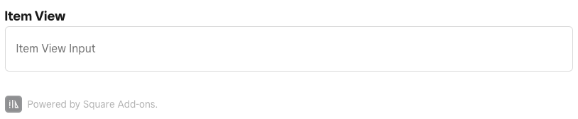
<ItemViewWidget title="Item View">
  <Form>
    <Field>
      <Input
        value={value}
        type="string"
        required={true}
      >
        <Text>
          Item View Input
        </Text>
      </Input>
    </Field>
  </Form>
</ItemViewWidget>
Properties
| Property | Type | Description |
|---|---|---|
title | string | The title of the view. |