List
A component that is almost always constructed of multiple Row components.
This component is almost never meant to be used on its own, and is generally used as a slotted components such as the Select or ButtonDropdown components.
Component render
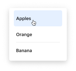
<List
  interactive={true}
  onChange={(values) => console.log(values)}
  onDeselection={(deselectedValue) => console.log(deselectedValue)}
  onNewSelection={(newValue) => console.log(newValue)}
>
  <Row value="Apple">
    Apples
  </Row>
  <Row value="Orange">
    Orange
  </Row>
  <Row value="Banana">
    Banana
  </Row>
</List>
Properties
| Property | Type | Description |
|---|---|---|
hideSelectableCount | boolean | Whether a count of selectable items rendered within the control row will be hidden. |
interactive | boolean | Whether or not the list is interactive. Results in list items receiving hover and active styling when hovered/clicked. NOTE: Lists slotted into a Select or ButtonDropdown will always be set to interactive by default. |
multiselect | boolean | Whether or not the list can allow for multiple selections |
name | string | String value used for the aria-labelledby attribute. |
onChange | (e: string[]) => void | A callback that fires whenever the value of the List changes. It will always return an array of strings representing the values of the currently selected rows |
onDeselection | (e: string) => void | A callback that fires whenever an item is deselected. It will contain the value of the row that was deselected. |
onNewSelection | (e: string) => void | A callback that fires whenever an item is selected. It will contain the value of the row that was selected. |
reorderable | "off" "internal" "external" | Whether the list is reorderable or not. Setting to internal enables reordering rows internally while external also allows dragging to & from other lists. |
transient | boolean | When set to true, rows/cards will not persist selected state on click. Only takes effect when interactive is true. |
value | string | any () | A string specifying a value for the list. To select multiple values, separate unique values with a comma (e.g. 'orange, pear' ). Setting to empty string ('') will clear all current selections. |
Slots
| Slot | Description |
|---|---|
control-row | You may specify one of the Rows in your list to be a control-row. This will turn on the functionality of the Select All type of criteria, where clicking on this row will either Select or Deselect all rows. See the checkbox example here |
Examples
Checkboxes with a control row
<List interactive={true} multiselect={true}>
  <Row value="All" slot="control-row" label="Select all">
    <Checkbox slot="control"></Checkbox>
  </Row>
  <Row value="Apple" label="Apple" subtext="This is an apple">
    <Checkbox slot="control"></Checkbox>
  </Row>
  <Row value="Orange" label="Orange" subtext="This is an orange">
    <Checkbox slot="control"></Checkbox>
  </Row>
  <Row value="Banana" label="Banana" subtext="This is an banana">
    <Checkbox slot="control"></Checkbox>
  </Row>
</List>
Radios
<List interactive={true} multiselect={true}>
  <Row value="Apple" label="Apple" subtext="This is an apple">
    <Radio slot="control"></Radio>
  </Row>
  <Row value="Orange" label="Orange" subtext="This is an orange">
    <Radio slot="control"></Radio>
  </Row>
  <Row value="Banana" label="Banana" subtext="This is an banana">
    <Radio slot="control"></Radio>
  </Row>
</List>