Single-Element Payment Form
Build a single-element payment form (Beta)
Prerequisites
Follow steps 1-5 of the Payment Form Setup Guide before continuing.
6. Add the Simple Card component
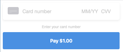
Using the SimpleCard component is an alternative to building a payment form if you don't need the flexibility of individually placed payment card fields. Read more about customizing the appearance.
import { SimpleCard } from 'react-square-payment-form'

<SquarePaymentForm {...props}>
  <SimpleCard />

  <CreditCardSubmitButton>Pay $1.00</CreditCardSubmitButton>
</SquarePaymentForm>
Only the first style object given to SquarePaymentForm's inputStyles prop will be applied to SimpleCard.
Caveats
You can NOT use digital wallets with SimpleCard. If you would also like to accept payments with Apple Pay for Web, Google Pay, and Masterpass, you'll need to create a separate instance of SquarePaymentForm with digital wallet configuration.
render() {
    return (
      <>
        <SquarePaymentForm
          sandbox={true}
          applicationId={APPLICATION_ID}
          locationId={LOCATION_ID}
          cardNonceResponseReceived={this.cardNonceResponseReceived}
          createPaymentRequest={this.createPaymentRequest}
          createVerificationDetails={this.createVerificationDetails}
        >
          <ApplePayButton loadingView={loadingView} unavailableView={unavailableApple} />
          <GooglePayButton loadingView={loadingView} unavailableView={unavailableGoogle} />
          <MasterpassButton loadingView={loadingView} unavailableView={unavailableMasterpass} />
        </SquarePaymentForm>

        <SquarePaymentForm
          sandbox={true}
          applicationId={APPLICATION_ID}
          inputStyles={[{ fontFamily: 'monospace' }]}
          cardNonceResponseReceived={this.cardNonceResponseReceived}
        >
          <SimpleCard />

          <CreditCardSubmitButton>Pay $1.00</CreditCardSubmitButton>

          <div className="sq-error-message">
            {this.state.errorMessages.map(errorMessage => (
              <li key={`sq-error-${errorMessage}`}>{errorMessage}</li>
            ))}
          </div>
        </SquarePaymentForm>
      </>
    )
  }